GSA Online Portal
In our Capstone project, my team redesigned the GSA website — an internal knowledge management system used by Amazon Global Security Operations.
Client
Amazon Global Security Operations
Team, Timeline
Team of 3, 10 weeks in 2019
My Role
User research, Product definition, Wire-framing, Concept testing, UI design
Challenge —―
"Ten seconds, two clicks"
Remember the last time you tried to find something in your corp net? You're sure there's a guide doc or a web app somewhere to help you out, but you don't know what exactly you're looking for , or how to find it. After 30 minutes of randomly searching and asking around, you finally get this url and type it into your browser, only to find that you don't have access to the link—or worse, that the link has been deprecated.
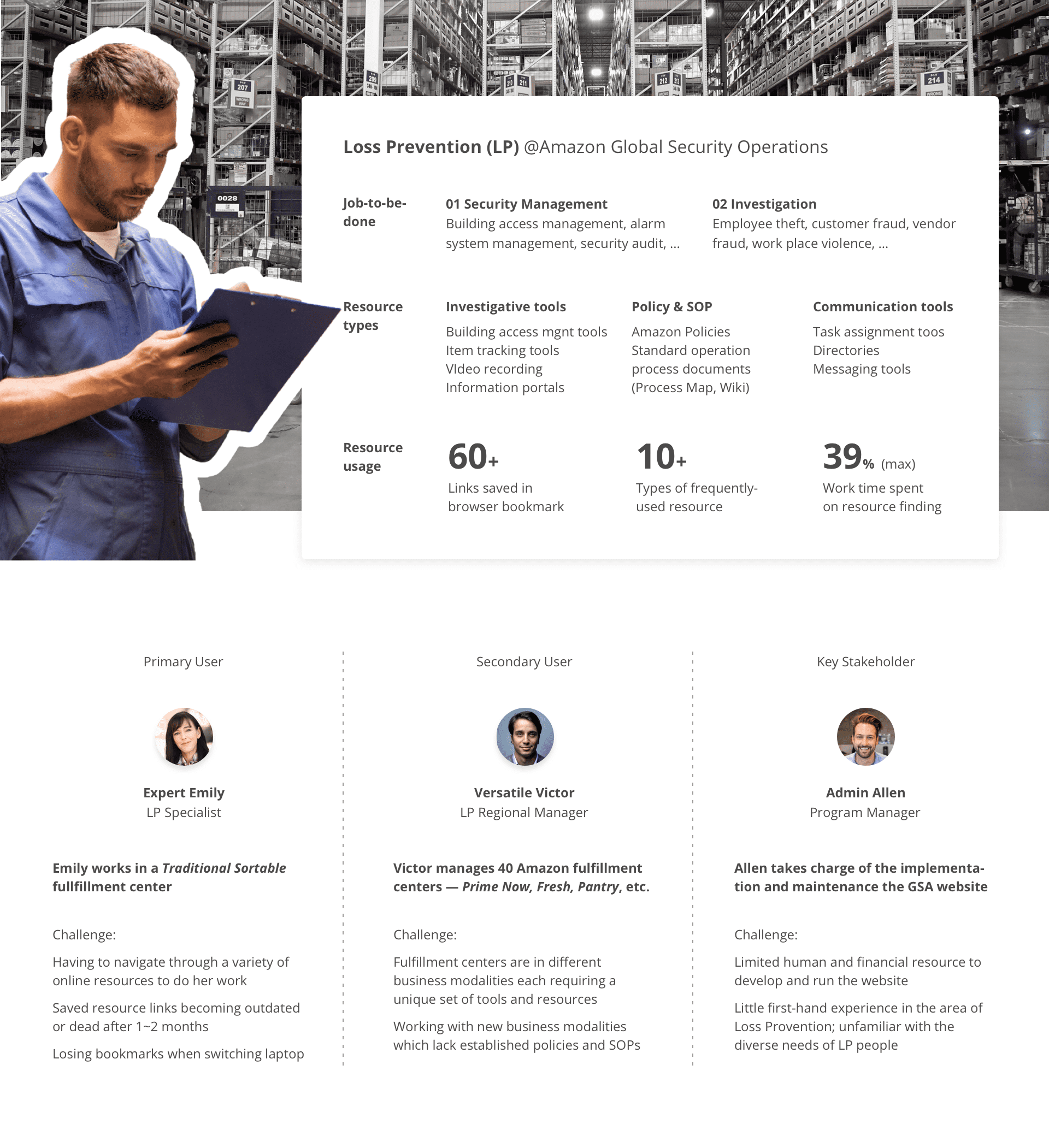
Locating online tools and resources is a top challenge for Amazon's Loss Prevention(LP) people. At Amazon, LP is responsible for protecting Amazon people, products, and data in fulfillment centers, and LP people rely heavily on a variety of websites and online documents to manage building security and investigate incidents. Resouce finding can be extremely time-consuming—a survey showed that looking up resources could take up as much as 40% of an LP person's work time.
Security Operation Support(SOS), the LP support team, set out to solve this problem. As the sponsors of our capstone project, they came to us with this challenge: how can we enable LP people to find whatever they need in "ten seconds and two clicks"?
Discover —―
First up—building empathy with our users
What is Loss Provention? What do LP people do? To learn more about our users, we conducted semi-structured interviews with both end users (LP professionals) and subject matter experts (training managers). Below I created a diagram to summarize our key findings.
What makes resource-finding so difficult?
Initially our client assumed that a better search functionality could serve as a silver bullet. Is that really the case?
To figure that out, we collected "failure stories" from 140+ LP professionals ("Tell us a time when you had trouble finding an online resource"), and mapped those failure stories on a journey map to pinpoint where things went wrong.
It turned out that a better searching experience may only solve 1/3 of the problem. We found three major gaps in the current user journey:

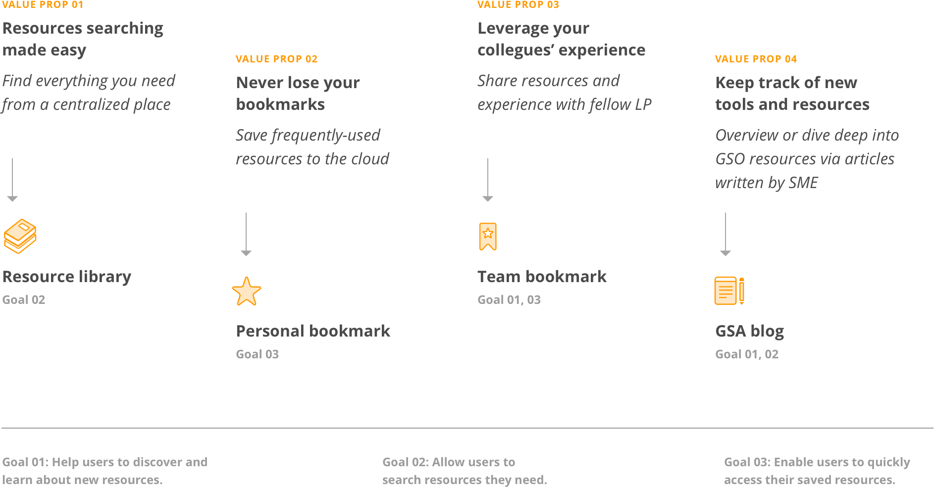
Targeting at the three gaps, we defined three design goals:
GOAL 1: Help users discover and learn about new resources
GOAL 2: Allow users to search resources
GOAL 3: Enable users to quickly access their saved resources
Ideate —―
Structured brainstorm
Moving forward, we broke each goal down to several how-might-we questions, and brainstormed for each question to generate product ideas.

Here's an overview of our top ideas:
Test —―
Low-fidelity prototyping
Next, we identified core user flows and turned our ideas into low-fidelity wireframes.

Concept testing
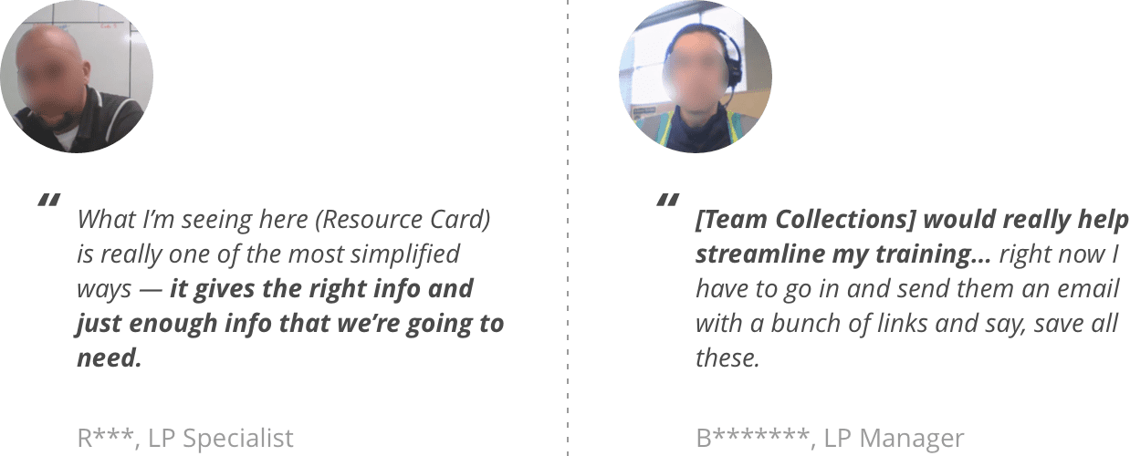
Before diving deeper into design details, we conducted five concept tests with future users to check out if our value prop makes sense. Overall, we heard great feedback from testing participants —
Missed user need: Instant access to saved resources
Meanwhile, participants also pointed out areas we overlooked. For example, three (out of five) participants mentioned the importance of being able to quickly access saved resources. We refined related pages based on that feedback.
Deliver —―
Final Deliverables
Now that we had made the major design decisions, we moved forward to finalize and document the design. We handed over our design to Amazon with a complete kit including (1) IA diagrams; (2) Flowcharts; (3) Annotated wireframes; (4) Style guides; and (5) UI mockups.
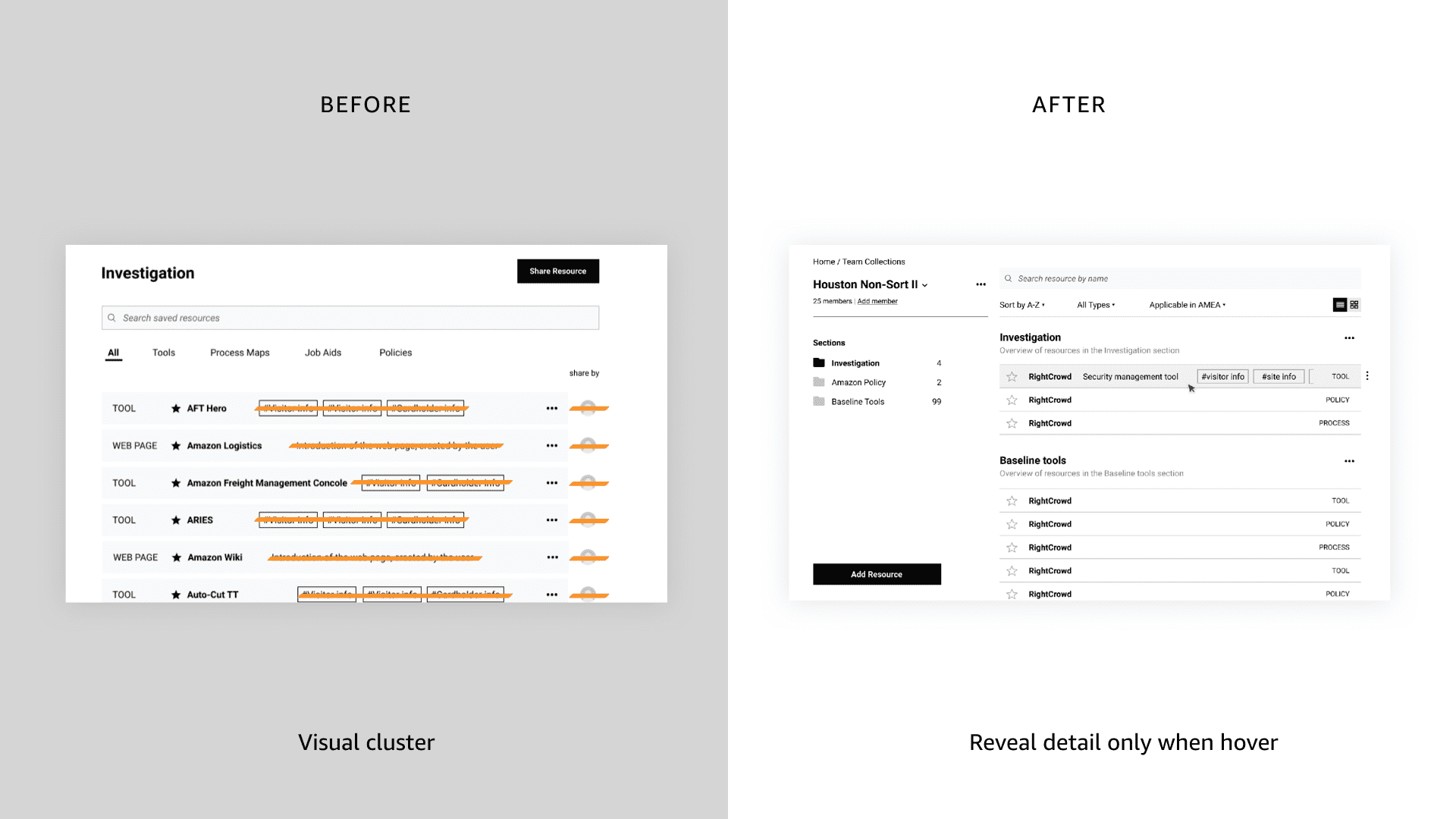
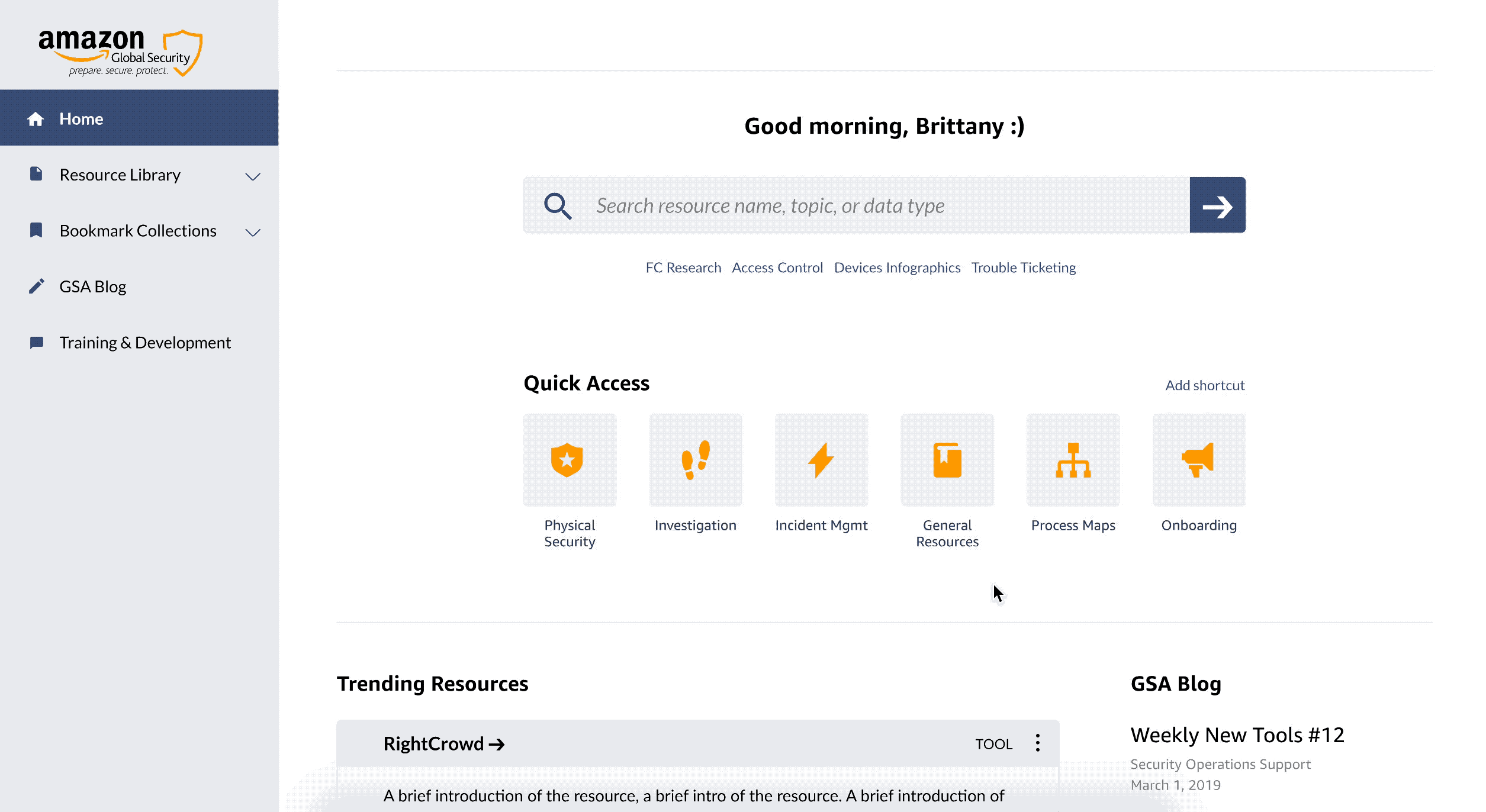
01 One location for all GSA resources
The biggest complaint from both users and stakeholders was that resources were "spread everywhere". Currently, users would need to use 3~5 different websites to search for one resource.
We proposed to build a resource library that serves as a one-stop shop for all GSO resources, where each resource is formatted as a "resource card". That'd enable users to easily find any resource, check out what the resource is about, and save the resource to their own bookmark within one website.
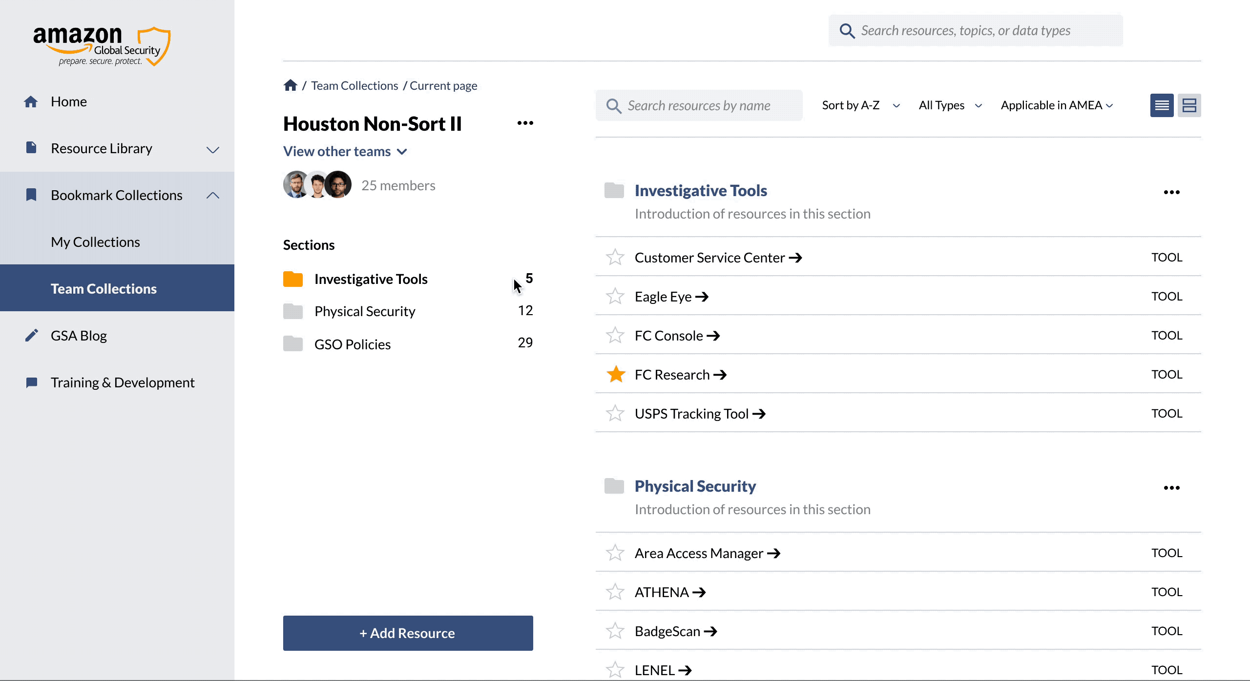
02 Never lose access to saved resources
From research we learned that a bummer for many people was the sudden loss of access to their saved resource links. It happened when they needed immediate access to the tool, and often took them forever to find an alternative resource.
In our design, a GSA admin is responsible to log in change info, so that when a resource deprecates, users will receive notice instantly. They can also find alternative resources within one click.
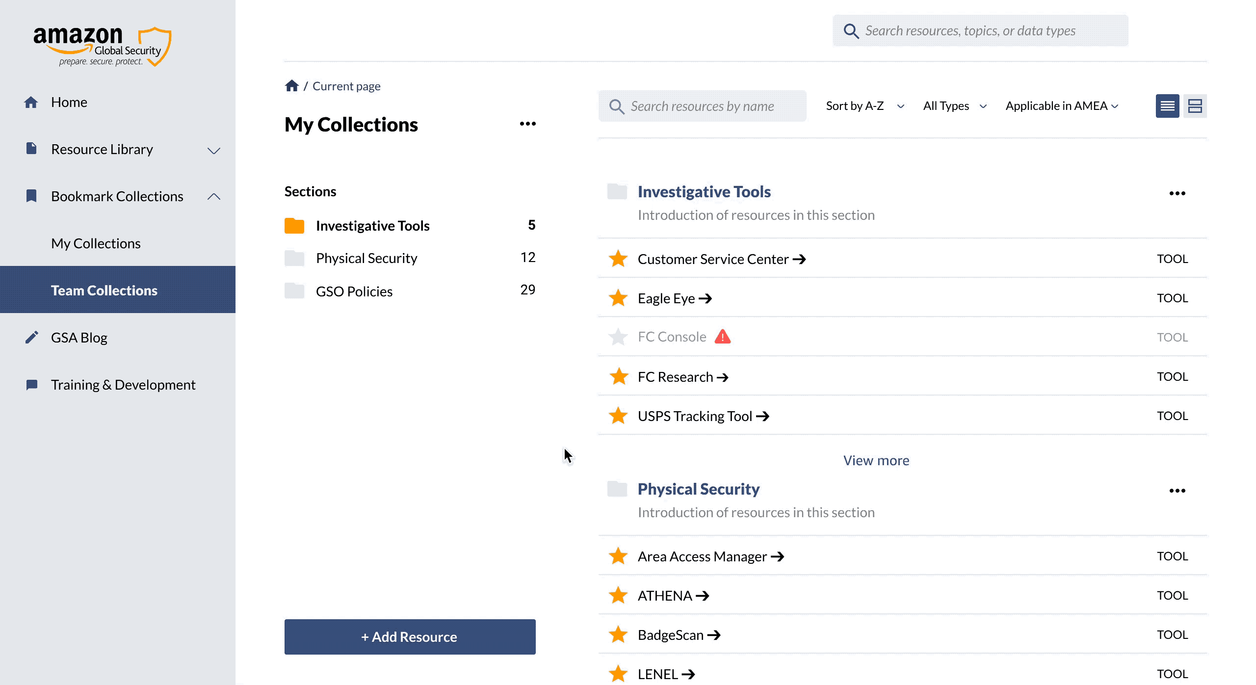
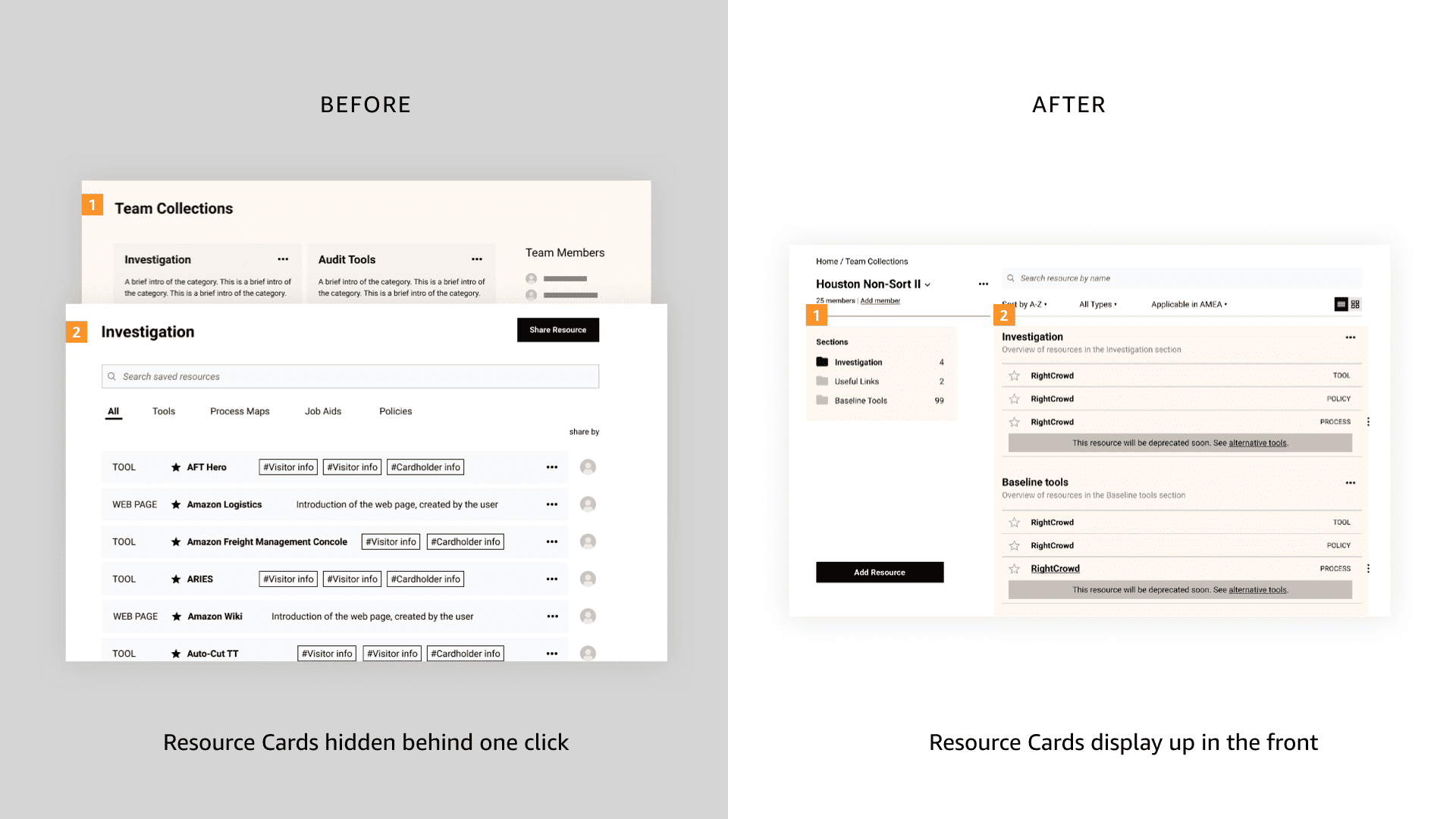
03 Lean on each other's knowledge
Team collection allows people share to useful resources with team members. That could help new hires to quickly familiarize with their resources, or allow old hands to share their experience before moving to another position.
When we presented that concept to users, many expressed the wish to check out not only their team, but also other teams' collections, since they'd love to discover tools and resources that are potentially useful for them. We iterated our design to respond to that user need.
04 Resource sharing: pull, not push
A common challenge for resource managers / owners was to reach to users to promote new resources. Currently, most people promote new resources via emails, which eventually get buried in end users' busy inbox.
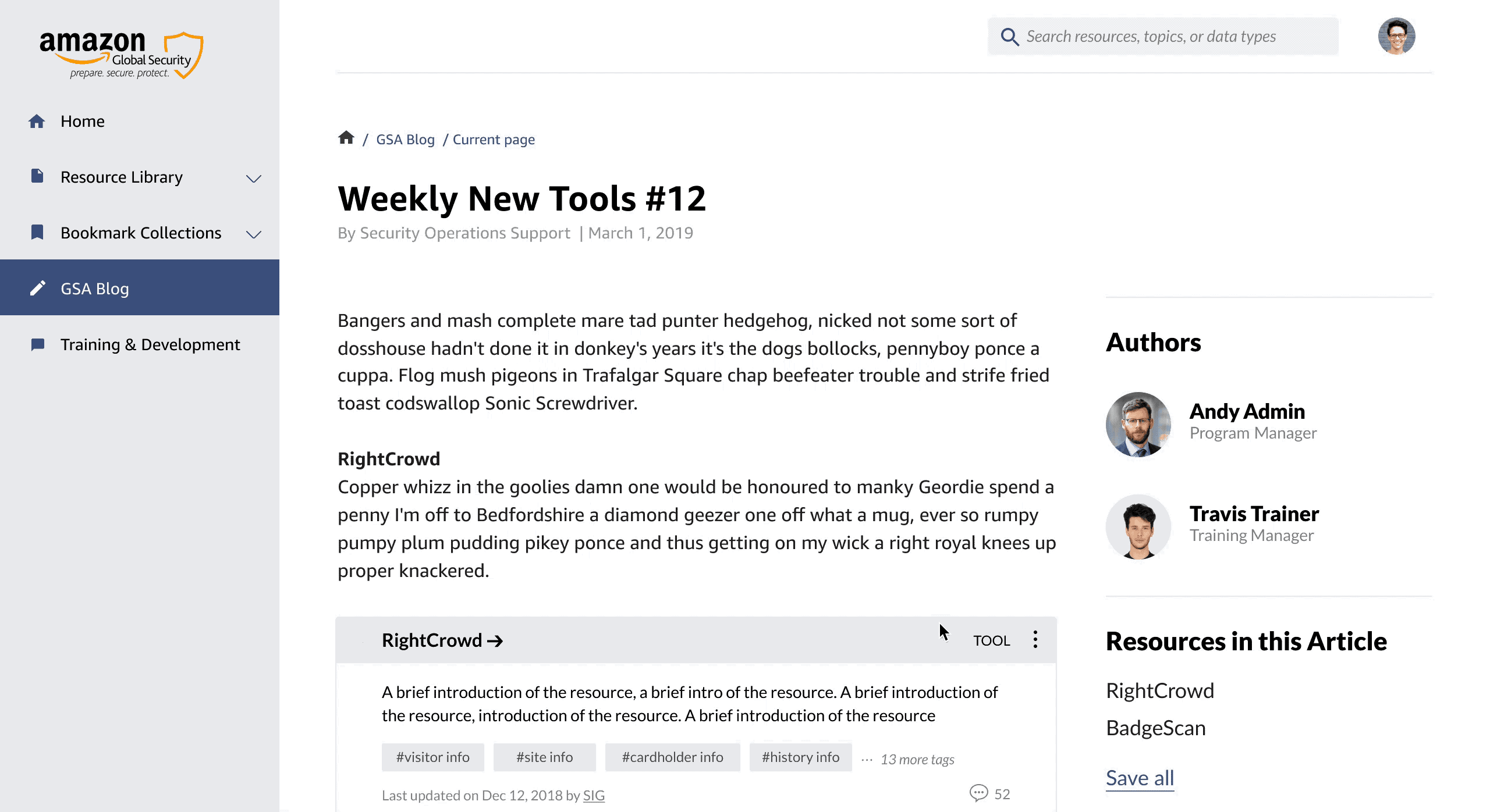
To make resource sharing more effective, we proposed "GSA blog". GSA blog provides a flexible way to share resources organized by topic. It could be an SME writing about new tools coming out, or an LP lead sharing best practice with certain tools. This way, users can choose to receive monthly news letter to review top blogs, or search a certain topic to check out related articles.
GSA blog also allows authors to insert "Resource Cards" in their articles, so that if a reader finds any resource interesting, she can save it with just one click.
Behind the scenes: mapping out the content management workflow
While our main focus was on the user experience, we always kept in mind that content is the key to the success of this platform. To address that, we helped our client map out the content management workflow to show how different stakeholders can work together to support the new GSA website.

Outro —―
Results
In April, we presented the design at Amazon and received great feedback from our sponsors. They were impressed by the completeness of our work and appreciated our efforts in making the website easy to build and maintain. Moving forward, the team at Amazon will use our design as a starting point to build the GSA website.
DEVISION OF LABOR:
Me: Research, product definition, wire-framing, testing & UI design
Natalie Huang: Ideation, design of style guide, wire-framing, testing & UI design
Meng Wang: IA research, design & testing
Next up
Mobile App • Internship Project
START
Streamline the car booking experience for a peer-to-peer car-sharing platform
View →