Start Booking Experience Redesign
Start is a Beijing-based P2P car-sharing platform (Airbnb for cars 🚗) with over 3,000,000 users. During my internship at Start, I redesigned the car booking user flow, which resulted in an 18% increase on page CTR one week after launch.
Client
Start (Car-Sharing Service)
Team, Timeline
Solo work, 4 weeks in 2017
My Role
User research, Competitive study, Wire-framing, Interaction design, User testing

Challenge —―
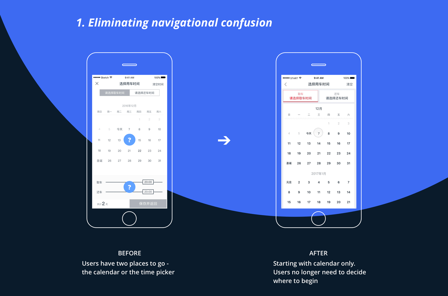
How might we streamline the car booking user flow?
START version 5.0 aimed at encouraging users to explore our car collections even when they were not actively trying to make a booking (i.e. “car shopping”.) However, the booking interaction for "shopping users" is very complicated -- that may prevent them from placing their order. How might we make car booking easier for “shopping” users?

What makes car booking so complicated?
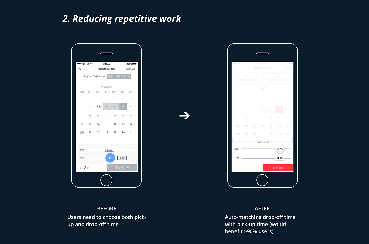
"Shopping users" did not need to choose a rental time period to start looking. While that made it easy for people to start browsing cars, when they were actually placing an order, they'd need to consider a lot of things all at once. To begin with, I listed information needed to display on the booking screen.
- Date: available / booked / not on share; selected dates
- Time: available / booked; selected time
- Price (vary with date)
Ideate —―
Paper prototyping
To begin with, I studied competitive applications and created paper prototypes to quickly test out design possibilities (date + time paring).

I identified two most promising directions (highlighted above) and created two digital prototypes.

Test —―
Which interaction pattern works better for users?
At that point, I was not sure which direction to go. From a designer’s point of view, I preferred the “stacked” pattern for its simplicity. However, I was not sure if users can understand how the time sliders work. I decided to conduct comparative usability tests to learn how users feel.


Key findings:
- All 16 participants found the time sliders in Ver 1 easy to understand
- Average time on task for Ver 1 was shorter
- Users had no strong preference between the two designs

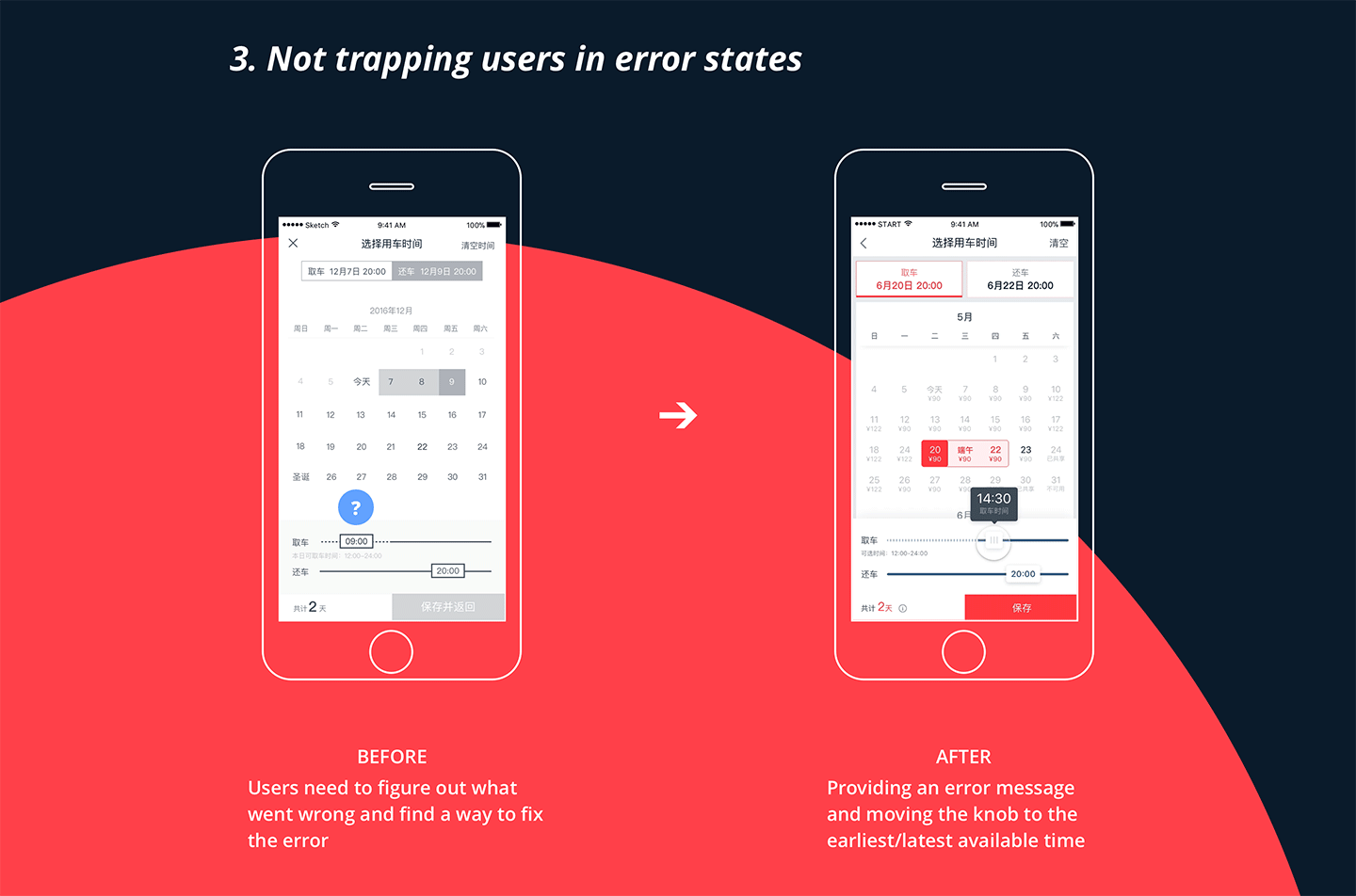
Is it easy to make precise selections with the "time slider"?
I shared the testing findings with the team. While people were convinced that version 1 ("stacked") would work better, our developers questioned the usability of the time slider. To test if there'd be enough screen real-estate to support precise selection on the slider, I created a realistic interactive prototype with Framer, and tried the slider on various screen sizes.


Synthesizing the findings, I decided to go with version 1 and shared the prototype with our engineers and the rest of the product team.
Refine —―
Crafting interaction details
Major design decisions being made, I moved forward to fix the usability issues identified in the usability testing, and polish the interaction to further streamline the user flow.
Deliver —―
Project requirement document
Finally, I wrote up a project requirement document to ship the design. During this process, I asked our PMs and QAs for feedback and identified and designed for many edge cases and error states.

Project outcome
- 18% increase on booking screen click-through-rate one week after launch
- Average time on task decreased by 25%
Next up
Website • Course Project
Fastback Studios
Help a recording studio connect with professional musicians
View →